
Franco Arda
Data Analytics Consultant
Microsoft Fabric Certified (DP-700)
"Dataflow Gen1 wird eingestellt: 100+ Schweizer Unternehmen müssen von Power BI zu Microsoft Fabric migrieren. Ich führe sie - von der Beratung
(bis zu C-Level) bis zur Implementierung. Laut Forrester: 379% ROI."
Erfahrung: Swisscom · Daimler-Benz · Siemens · BMW · DHL
Nationalität: Schweizer
Sprachen: Schweizer Deutsch · Deutsch · Englisch
Ausbildung: Ph.D. in Data Science · MBA
Portfolio:
Technical:
Architecture overview
The architecture uses four operational phases to move from raw sensor data to automated action:
-
IoT sensors in refrigerated and frozen units continuously monitor temperature across all store locations.
-
Azure Event Hubs collects environmental data to predict how external conditions affect temperature readings.
-
Eventstreams ingests and processes incoming temperature data in real time.
-
Eventhouse stores and processes the data. Anomaly alerts flag units with frequent temperature spikes for proactive maintenance.
-
Natural Language Copilot lets store associates and analysts query temperature trends conversationally.
-
Real-Time Dashboard gives managers and regional supervisors a live view of refrigeration performance, trends, and food safety compliance.
-
Activator triggers real-time alerts when temperatures breach thresholds, prompting immediate inspections and protecting food safety.
Operational phases
Ingest and process
IoT sensors monitor temperature across refrigerated display cases, walk-in freezers, dairy and produce areas, medication storage, and cold prep zones.
Azure Event Hubs captures environmental inputs — external weather, humidity, store traffic, door-open frequency, and HVAC performance — to predict their impact on refrigeration.
Example: A 150-location grocery chain processes temperature data from thousands of sensors while correlating weather, traffic, and HVAC data to optimize refrigeration performance chain-wide.
Analyze and transform
Eventstreams handles real-time processing: temperature validation, zone aggregation, environmental correlation, automated routing, and cross-location comparison.
Eventhouse stores the data and powers anomaly detection — flagging units with temperature spikes for maintenance before issues escalate.
Query
Natural Language Copilot lets store associates run conversational queries on temperature trends and historical data — no technical skills required.
Visualize and activate
Real-Time Dashboard gives managers and supervisors a multi-location view of refrigeration health, trends, and compliance status.
Activator sends real-time alerts for threshold breaches — triggering inspections, maintenance notifications, and food safety responses automatically.
Technical benefits
-
Real-time monitoring — Continuous visibility across all refrigeration units and locations
-
Predictive maintenance — Early detection reduces downtime and repair costs
-
Food safety compliance — Automated alerts and reporting keep operations within regulatory requirements
-
Energy optimization — Intelligent monitoring reduces unnecessary energy consumption
-
Customer experience — Reliable refrigeration means better product quality and fewer stockouts


Switzerland's photovoltaic buildout is accelerating rapidly — with over 7 GW of installed capacity today and a federal target of 34 TWh of solar generation by 2035, grid operators, industrial asset owners, and energy utilities face a growing challenge: keeping large and often hard-to-reach PV installations performing at their peak.
Traditional inspection methods — rope teams, manual thermal checks, or periodic aerial surveys — are costly, infrequent, and slow to surface faults. In alpine environments where snow loads, soiling, and physical access compound the problem, a single undetected defect can quietly erode yield for months.
This solution brings together drone-based thermal and visual imaging, automated defect detection powered by computer vision, and real-time asset intelligence — all built on a unified Microsoft Fabric data platform. Drone-mounted sensors are capable of identifying four critical fault categories at scale:
-
Localized cell failure — individual cells with thermal anomalies (hotspots) that reduce string output and risk cascading damage
-
String-level failure — entire strings dropping off-line due to inverter, bypass diode, or wiring faults
-
Dirt and dust accumulation — soiling patterns detected via visual imaging and correlated with yield loss data
-
Physical panel degradation — micro-cracks, delamination, and glass damage identified before they cause irreversible yield loss
Imagery flows directly into a Fabric Data (real-time, batch, or both), where AI models classify panel-level faults and results surface in Real-Time Dashboards or Power BI dashboards tailored for asset managers and O&M teams. Maintenance tickets are generated automatically, closing the loop from detection to resolution.
The business case is concrete:
-
Inspection costs reduced by up to 60–70% compared to rope access or manual thermal surveys
-
Faults detected 4–8 weeks earlier, recovering an estimated 1–3% of annual energy yield
-
Inspection cycles shortened from yearly to quarterly or on-demand
Dataset
Mockup dataset simulating a drone inspection of a solar farm. GPS coordinates clustered around St. Gallen (47.43°N, 9.31°E). 3 drones (drone_01–03) covering panel zones A–D, spaced at realistic 60–90 second intervals.
Anomaly rate intentionally set at ~55% (11/20 rows).
Anomaly Types & Severity
-
hot_spot — Localized cell failure · severity 6.8–8.9 · temp delta +17–26°C
-
bypass_diode — String-level failure · most critical · severity 9.1–9.7 · temp delta +28–31°C
-
soiling — Dirt/dust accumulation · lowest priority · severity 2.4–3.1 · temp delta +5–6°C
-
delamination — Physical panel degradation · severity 5.3 · temp delta +12°C


Since Microsoft Fabric is an end-to-end analytics platform, we never have to leave Fabric to write code. For example, if we want to enrich our solar panel inspection data, we can do so using a Notebook (a Data Scientist's favorite) with PySpark — or plain Python for smaller datasets (under 100 million rows).

Picture a heart attack. A dirty solar cell or panel is like a clogged artery — and if enough arteries stop pumping, the whole system seizes up and fails. One common way this plays out comes down to frame design and how panels are installed. Most solar panel frames trap a small amount of water along the bottom edge.
When that water carries any dirt or debris, it leaves behind a soiling deposit as it evaporates, which then causes the affected cells to overheat. The panel shown below is likely suffering from exactly this: a buildup of dust along its lower edge creating partial shading — a clear example of which is visible in the image.

With Microsoft Fabric, we can create smart alerts for any observed variable — such as dirt/dust accumulation or localized cell failure — enabling technical teams to receive automated notifications via email or Microsoft Teams. For example: "Solar panel A14: anomaly detected — localized cell failure (confidence: 94%)." This eliminates the need for constant dashboard monitoring, unless real-time observation is specifically required.

Microsoft Fabric captures drone flight paths in real-time and stores them for post-mission analytics. For the pilot, live geo-tracking improves situational awareness across large or complex installations. For drone operators, recorded flight routes provide verifiable coverage evidence — supporting ESG audits and ensuring no panel zone is missed between inspection cycles.

This reference architecture shows how to build a comprehensive e-mobility charging network solution using Microsoft Fabric Real-Time Intelligence — processing live data from thousands of charging stations to enable smarter operations, predictive maintenance, and revenue optimization.
The platform handles real-time usage data, station state, and energy cost rates at scale. Thousands of stations stream continuously; energy pricing flows in via MQTT; station metadata syncs daily. Together they form a unified intelligence layer for managing large charging networks with confidence.
Architecture overview
The architecture is built around four operational phases: Ingest and process → Analyze, transform, and enrich → Train → Visualize and activate.
-
Thousands of charging stations stream real-time usage and state data.
-
Energy cost rates stream in via MQTT-Eventstream integration.
-
Station metadata and asset information is collected and refreshed daily.
-
Charging events are enriched on the fly with asset data, producing fully curated, consumption-ready datasets.
-
Usage data is aggregated and correlated with energy rates for a unified view of cost and performance.
-
ML models are built, trained, and scored in real time to predict usage and station availability.
-
A Real-Time Dashboard provides high-granularity visibility across the entire network — drillable down to individual sockets.
-
Power BI delivers rich business intelligence reports querying live data directly.
-
Automated alerts notify field technicians the moment a station malfunctions or behaves anomalously.
Operational phases
Ingest and process
Real-time charging station data flows into Eventstreams for ingestion and enrichment. In parallel, energy cost rates arrive through MQTT integration. Three data streams feed the platform continuously:
-
Live station telemetry — usage patterns, operational state, availability, and performance metrics.
-
Energy cost rates — real-time pricing for cost optimization and billing.
-
Station metadata — specifications, locations, maintenance history, and hardware configurations, updated daily.
To put the scale in perspective: a major operator with 15,000 stations processes over 500,000 events per day — session starts and stops, power readings, connector status, payment transactions, and diagnostics. Eventstreams handles this velocity while applying real-time enrichment with station specs, network topology, and maintenance schedules.
Analyze, transform, and enrich.
Powerful Alerts without Alert Fatigue
The true power of this service lies in its ability to handle stateful transitions, enabling you to act on significant changes without alert fatigue. Rather than firing on every fluctuation, it tracks how conditions evolve over time — and only reacts when something meaningful has actually changed.
Consider an EV charging network: each charging station is modeled as an object with the station's ID as the key, and Activator accumulates the state of each station — current number of available chargers, recent charging activity, and more — independently. A rule like "Alert if a station has no available chargers for 30 minutes" is then evaluated per station, using that station's own event history and state.


This per-object design is what makes the approach powerful. Each charging station or individual charging port (identified by a unique ID) becomes an active object with its own stream of availability and status readings, allowing the system to detect patterns and anomalies at the individual level rather than across a noisy aggregate.
In effect, the system gives every object its own memory. It continuously monitors conditions — charger availability, fault states, inactivity, trends — and acts on them in isolation for each instance. This is what allows Activator to reliably trigger the right action (an alert, a notification, or a workflow) for the right entity at the right time, and not a moment sooner.

Working with data streams presents fundamentally different challenges than batch processing. Streams are continuous, with no predetermined start or end point. While events typically arrive in chronological order, network latency, system failures, and distributed sources can cause out-of-order delivery, late-arriving data, and duplicates.
For this example, I'm using a straightforward streaming intelligence approach. A more advanced alternative — the Lambda architecture — combines batch and stream processing for large-scale, low-latency workloads, but it comes with significant setup and maintenance overhead. For most use cases, the simpler approach is sufficient.
It supports all the key operations you'd need:
-
aggregation
-
filtering
-
grouping
-
joins
-
field management
-
unions
-
splits
-
row expansion
Fabric's Eventstream also covers all five stream analytics windowing functions:
-
tumbling
-
hopping
-
sliding
-
session
-
snapshot
Processing the IoT Data
For this example, I'm using Fabric's built-in bicycle demo data.

Step 1 — Save the raw data
The raw data is saved to a dedicated table in a KQL database. This serves two purposes: it acts as a backup if you need to reprocess the data, and it enables ML workloads — since Eventhouses support Notebooks (e.g., PySpark for datasets exceeding 100M rows), you can run machine learning algorithms directly on the raw stream.

Step 2 — Transform the streaming data
The transformation aggregates available bike counts by pickup point and time window. The key components are: the sum of available bikes, a group-by on BikepointID, and a tumbling (fixed) window for the time dimension. The result is saved as a new table in the same Eventhouse — keeping it separate from the raw data.
The output shows available bikes per station in real time. Since continuous manual monitoring isn't practical, the next step is setting up automated alerts.


Anomaly Detection in Real-Time Intelligence
Note: This feature is still in preview as of May 2026.
Microsoft's anomaly detection is generally quite capable — Power BI uses a similar engine to identify trends, seasonality, and noise. In most cases, an out-of-the-box solution like this is preferable to building a custom one, particularly for real-time data where a continuously running algorithm can become costly. That said, the capacity unit (CU) costs for Fabric's anomaly detection aren't fully clear to me yet.

Real-Time Alerts with Fabric Activator
Rather than monitoring data manually, Fabric Activator lets you define alerts triggered by specific conditions at the pickup point level. Configuration involves four elements: the alert trigger, the condition, the action (email or Teams message), and the alert message text.

Operations agents (currently in preview as of May 2026) in Fabric Real-Time Intelligence help organizations turn real-time data into immediate, actionable decisions. Rather than relying on manual monitoring and intervention, agents continuously track key metrics, surface insights, and recommend targeted actions — enabling teams to respond faster and optimize operations at scale.
Each operations agent is a dedicated Fabric item, scoped to a specific business process. By configuring agents with clear goals, instructions, and data sources, you can deploy multiple agents as virtual experts across your organization. This modular approach ensures that every critical process is monitored and continuously improved, with recommended actions always aligned to your strategic objectives.
The following levels illustrate how agents can grow in sophistication — from simple threshold alerts to complex, cross-domain reasoning.
Level 1 — Single source, single trigger, predefined rule
"Warehouse stock for Product X in Stuttgart has dropped below 500 units. Recommended action: reorder from primary supplier."
The operation agent watches one metric, knows one threshold, suggests one action. No reasoning, no context, no relationships. A sophisticated alert system — but one that acts: with Power Automate connected, the reorder is placed automatically the moment the operator clicks Yes. No system login, no manual entry..
Level 2 — Multiple internal sources, pattern recognition, contextual recommendation
"Warehouse stock in Stuttgart is declining 40% faster than the seasonal norm. Current supplier lead time has increased from 12 to 19 days over the past month. At the current consumption rate, stockout risk is high in 18 days. Recommended action: accelerate the next scheduled order and notify logistics."
The agent is now connecting internal dots — inventory trends, supplier performance history, consumption patterns — and reasoning across them. Still entirely inside your own data, no external signals yet. And when the operator clicks Yes, Power Automate orchestrates the response: an approval request goes to the procurement manager via Teams, the purchase order is raised in SAP on approval, the logistics team is notified by email, and the lead time risk is flagged in the supplier dashboard. All without leaving the chat.
Level 3 — Internal data + external signals + geopolitical risk mapping + predictive action
"A typhoon warning has been issued for southern Taiwan. Two of your active suppliers are registered in that region and together cover 60% of your resin intake. You have 11 days of buffer. Your next-best alternative has a 3-week lead time. Recommended action: trigger a contingency order today."
The agent now crosses the boundary of your own data — correlating supplier locations against live external event feeds, calculating exposure as a share of total intake, and stress-testing your buffer against realistic lead times. Internal and external signals converge into a single risk picture, with a recommended action delivered before the disruption reaches you.
Example:
First, we need to create an Eventstream (data streaming) and an Eventhouse (storing the streamed data) with some simple filters:

Next, we define the job for the Operations Agents and the actions to take:

Below is a sample message from the Operations Agent (generally in Teams):

(1) describes the recommended action by the Operations Agent and (2) the recommended action to be approved by a human (which they can trigger an action in Power Automate).
We will build the Medallion Architecture: a layered data structure designed to progressively refine raw data into reliable, analysis-ready information. It consists of three distinct layers, each serving a specific purpose in the data lifecycle.
Bronze Layer: Raw Data
This is the entry point for all incoming data. Sources such as logs, files, and event streams land here in their original, unmodified form — including incomplete records or inconsistencies. Nothing is altered or discarded at this stage. Preserving the raw data in its original format ensures a reliable audit trail and gives you the ability to reprocess or revalidate data at any point in the future.
Silver Layer: Cleaned and Structured Data
In this layer, raw data is validated, cleaned, and restructured. Duplicates are removed, errors are corrected, and data types and formats are standardised to make the data suitable for analysis. For example, customer records might be normalised to ensure that names, addresses, and identifiers are consistently represented across all records. The Silver layer is where raw noise becomes trustworthy, structured information.
Gold Layer: Refined Data for Reporting and Analytics
The Gold layer contains data that is fully refined and ready for business use. It is optimised for fast queries and typically holds pre-aggregated datasets and business-specific enrichments. For instance, it might contain summarised sales figures broken down by region and product category, ready to feed dashboards, reports, and machine learning models. This is the layer that end users and analytical tools interact with most directly.

The Medallion Architecture brings structure and discipline to the challenge of managing large volumes of data. By processing data in clearly defined stages, it ensures that everyone working with the same dataset — whether building dashboards, training models, or making business decisions — is working from the same high-quality, well-understood information.
How It Works in Microsoft Fabric
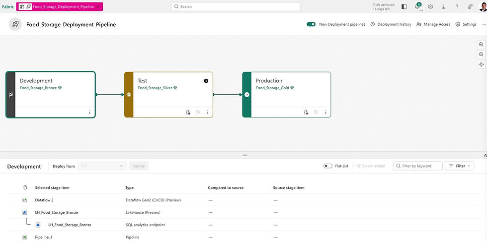
In Fabric, each layer corresponds to a dedicated Lakehouse in its own Workspace. Data moves forward through the layers via Notebooks orchestrated by Pipelines. The typical pattern is a Notebook triggered by a Pipeline, with the source Lakehouse attached as the input and the destination Lakehouse written to explicitly via its abfss:// path. This approach produces physical Delta tables at each layer that are fully independent of one another.
The layers also map naturally to deployment stages:
-
Development — Bronze Lakehouse only
-
Test — Bronze and Silver Lakehouses
-
Production — Bronze, Silver, and Gold Lakehouses
Why Not Use Shortcuts?
Shortcuts might seem like a convenient way to make Bronze data available in Silver without copying it, but they undermine the architecture's core guarantee. A Shortcut is a live pointer, not a copy — if the Bronze data changes or is deleted, Silver reflects that change immediately. For the Medallion Architecture to work correctly, each layer must hold its own independent, stable copy of the data. Shortcuts break that contract and should be avoided for inter-layer data movement.
Dataflow Gen1 is legacy. Here's what that means for you.
Microsoft Fabric · April 2026
Migrating to Microsoft Fabric isn't just a technical upgrade — it's a strategic opportunity to finally build a data platform that scales, governs itself, and powers AI.
Three things that change
-
Data governance, one platform. Say goodbye to data chaos. One place, one truth, one set of rules.
-
The semantic model as product. No more 10 DAX formulas for the same metric. Define it once, use it everywhere.
-
Faric is the foundation for AI. Copilot, Data Agents, Real-Time AI Agents — they all need clean, structured data to work.
What changes in Dataflow Gen2
-
Autosave. Sounds small. It isn't. Nothing kills momentum like losing an hour of query work. Autosave eliminates that entirely.
-
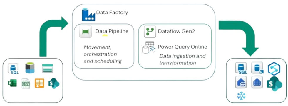
Data destinations. The real shift. Data lands in OneLake — Lakehouse or Warehouse — not just a Power BI dataset. This is what makes Fabric an end-to-end solution.
-
Pipeline integration. Gen2 isn't just ETL anymore. Inside a Data Pipeline, it becomes ELT — load first, transform later, orchestrated automatically.
How the pattern shifts
Power Query in PBIX → Data Pipeline → Dataflow Gen2 → Semantic Model
Migrating isn't just about moving files. It's about rethinking where logic lives — and building it once, properly, upstream.
After 10+ years in data analytics, I've never seen a more exciting platform for doing data science in production — whether you're a small company or a large enterprise. The reason is simple: everything lives in one place. No switching between tools. From data ingestion to data science, pipelines, semantic models, and ultimately Power BI, it's all connected.
Data Science in Microsoft Fabric
For data enrichment and business insights, Microsoft Fabric offers a complete data science experience — enabling end-to-end workflows built directly on governed enterprise data in OneLake. This means you can access curated datasets, shared data, and model predictions without ever moving data between systems.
Data engineers, data scientists and business analysts work on the same platform. Sharing and collaboration become seamless across roles: analysts can share Power BI reports and datasets with data science teams, and hand-offs during problem formulation are far smoother. Cross-tenant data sharing in OneLake even enables multi-organization collaboration, giving data science teams governed access to datasets from external partners or subsidiaries.
Sample dataset (mockup Walmart sales): What will my store sell next week?

Data Discovery and Preprocessing
The Lakehouse resource is the primary way to interact with data in OneLake. It attaches directly to a notebook, making it easy to read data into a Pandas dataframe for exploration without any extra setup.
OneLake shortcuts extend this further by providing no-copy access to data stored in external systems or other Fabric workspaces and tenants. You can attach a shortcut to a Lakehouse and read that data in notebooks — no duplication, no ETL required.
For data ingestion and orchestration, Fabric's natively integrated data pipelines make it straightforward to build workflows that access and transform data into formats ready for machine learning.
In April 2026, Microsoft made a significant announcement: after 8 years, Dataflow Gen1 — essentially Power Query in the cloud — is being retired. With thousands of companies now facing a migration to Dataflow Gen2 in 2026, the question isn't if you need to make the move, but how to do it smoothly.
The good news? Dataflow Gen2 isn't just a like-for-like replacement. It's a genuine upgrade — and once you see what it unlocks, you might find yourself wondering how you ever managed without it.
Here are the two biggest advantages that make Dataflow Gen2 worth getting excited about:
-
Store data wherever you want
-
Seamless integration with Data Pipelines
1. Store data wherever you want
Dataflow Gen1 was always a bit of a walled garden — your transformed data lived in its own internal storage, and that was that. Dataflow Gen2 tears down that wall entirely.
With Gen2, you choose where your data lands. Want to feed a Lakehouse and analyze the results in a notebook? Go for it. Need to route data into a Warehouse via a Data Pipeline? No problem. This flexibility isn't just a nice-to-have — it's a direct reflection of Microsoft Fabric's vision as a true end-to-end analytics platform, where data flows freely across the entire stack.
As of today, Dataflow Gen2 supports the following destinations:
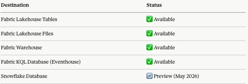
2. Microsoft Dataflow Gen2 + Fabric Pipelines: A Match Made in Data Heaven
This is genuinely a game-changer — and it perfectly embodies what Microsoft Fabric was built to be: a true end-to-end analytics platform, not just a collection of disconnected tools.
Pipelines are your orchestration powerhouse. Think of them as intelligent workflows that bring everything together — copying data, firing SQL queries, executing stored procedures, spinning up Python notebooks — all chained together into a single, unstoppable sequence. Need to land raw data into a Lakehouse, reshape it on the fly, and have it analysis-ready before your team's Monday morning standup? Done.
And here's where it gets really exciting. Because Dataflow Gen2 plugs directly into Pipelines, you're no longer choosing between storing data and shaping data — you do both, in one orchestrated flow. Store your data in a Lakehouse via the Pipeline, then hand it straight off to Dataflow Gen2 to combine, clean, and transform it. No duct tape. No manual handoffs. Just seamless, end-to-end data movement.
Real-world example? Every Monday, your pipeline pulls raw log data from an Azure Blob, dumps it into a Lakehouse — then immediately kicks off a Dataflow Gen2 to analyze and shape that data into something meaningful. Or at month-end, copy data from Azure Blob to Azure SQL, run a stored procedure, and let Dataflow Gen2 layer on the business logic. All scheduled. All automated. All inside Fabric.
This is what modern data engineering looks like — and honestly, it's pretty hard not to get excited about it.
From Raw Data to Churn Prediction — Automated, End-to-End in Microsoft Fabric
The pipeline above tells a complete data story in three steps. Let's walk through what's actually happening under the hood.
Step 1 — Dataflow Gen2: Pull & Land the Data
(shown as greyed out — runs independently prior to the pipeline)
Before the pipeline fires, Dataflow Gen2 quietly does the heavy lifting. It connects directly to a MySQL database, pulls the latest customer data, and lands it clean into a Fabric Lakehouse — no manual exports, no CSV files, no duct tape.
This step is shown greyed out intentionally. In practice, Dataflow Gen2 operates independently and its output is already sitting in the Lakehouse by the time the pipeline kicks off. It's included here to tell the full story visually.

Step 2 — Copy Data: Run the Churn Prediction Notebook
Once the customer data is in the Lakehouse, the pipeline triggers a Fabric Notebook that runs a trained Machine Learning model. The model scores each customer and enriches the dataset with a new column: churn prediction.
The enriched dataset is then written back to the Lakehouse — same data, now smarter.
Step 3 — Semantic Model Refresh: Power BI, meet fresh data
With the enriched data in place, the pipeline automatically triggers a refresh of the Churn Semantic Model. By the time your sales or customer success team opens Power BI in the morning, they're already looking at last night's predictions — no manual refresh, no stale numbers.
The big picture
What makes this pipeline powerful isn't any single step — it's the orchestration. Schedule this to run every night at 2am and you've built a fully automated churn intelligence system inside Microsoft Fabric. Raw MySQL data in. Business-ready Power BI dashboard out. Everything in between, handled.
Data architecture is the overall design and organisation of data within an information system — and getting it wrong is expensive.
When building a data solution, you need a well-thought-out blueprint. A data architecture defines your high-level approach, the technologies you'll use, and how data flows through your solution. There's no "one size fits all" answer, which is exactly what makes the decision so challenging. The framework below cuts through that complexity — focused specifically on Microsoft Fabric.
Start with the system, not the tool
When starting in Fabric, everyone wants to know: should I use a Lakehouse, a Warehouse, or an Eventhouse? A lot of people pick their tool as a starting point — but personally, I think that's the wrong place to begin. Those are implementation choices, and architecture starts well before that.
Most teams start with tools or patterns. They pick a Lakehouse, a Warehouse, or an Eventhouse — or decide they'll use a medallion architecture or a star schema — and then try to make everything fit that choice. That's when things get overbuilt. Tools don't define architecture; we pick the tool to do the implementation.
The better question to ask is: what kind of data system am I building inside this domain? Once you answer that, the structure becomes clear — and the tool just follows along.
The most important principle:
the tool is an implementation of the system, not the starting point.
This is where medallion and star schema come in. Medallion is a layering pattern, and sometimes it makes perfect sense — but layering is a decision, not a requirement. Not every system needs bronze, silver, and gold. Not every data model needs a star schema. I've worked on many projects where we used an OBT (one big table). For Machine Learning and Data Science workloads, for example, we ultimately need a single, flat table anyway.
Choosing your engine

The blueprint routes you through three questions in order:
-
Is the data streaming or time-series? If yes, stop — Eventhouse is the answer. KQL is built for this; Warehouse and Lakehouse are not.
-
Is it structured and SQL-first? If yes, the tie-breaker is scale and ACID needs. Enterprise, governed reporting with clean schemas → Warehouse. Simpler or exploratory SQL → Lakehouse via its SQL analytics endpoint.
-
Mixed formats, raw files, or ML workloads? That's Lakehouse territory — Delta Lake, Spark, and the flexibility to evolve schemas later.
Then the overlays: data marts are a serving layer on top (great for domain or departmental teams), not a replacement. Data mesh is an organisational principle — it tells you who owns the domains, not which engine runs them.
Don't treat these as mutually exclusive
The most expensive mistake is treating these engines as either/or. A mature Fabric architecture often uses all three — Eventhouse for real-time, Lakehouse as the medallion foundation, Warehouse for governed BI — connected via OneLake.
For most users, Python and PySpark are the default choices for working with data in Microsoft Fabric. Fabric's own guidance steers you toward Python notebooks for fast, iterative work and PySpark notebooks for distributed, production-grade Spark workloads — and for good reason. Knowing when to reach for each one can save you both time and money.
A SIMPLE RULE OF THUMB
For small to medium datasets (under ~100M rows), plain Python is typically faster, simpler, and cheaper in terms of Capacity Unit (CU) costs. PySpark becomes the better choice once you're working at scale — think 100M+ rows or 10 GB+. At that point, Spark's distributed processing starts paying for itself.
⚠️ ATTENTION: Don't Forget Pipeline Costs
Processing costs don't stop at notebooks. Data Pipelines also consume CUs, and they can rack up costs quickly if you're not careful. In a recent project, I needed to reduce a dataset down to 310 million rows — at that scale, running the entire pipeline in PySpark was the right call, both for performance and cost control.

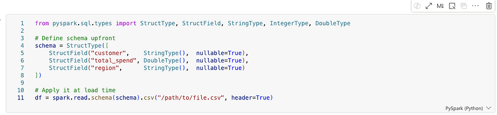
1. DEFINING THE SCHEMA
Defined schemas are essential in production pipelines. In Fabric, where pipelines run repeatedly on large datasets, defining the schema upfront avoids costly type inference and runtime surprises. Whether you're writing Python or PySpark, this is a habit worth building early — it pays dividends as your data and team grow.
2. PARTITIONING
Partitioning becomes critically important as your data scales. Spark processes data in parallel chunks called partitions, and your partitioning strategy has a direct impact on three things:
-
Query speed — Spark can skip irrelevant partitions entirely (known as partition pruning), dramatically reducing scan time
-
Shuffle cost — poor partitioning forces expensive data movement across nodes during joins and aggregations
-
Memory pressure — too few partitions means large chunks per node; too many creates excessive overhead from small file management
The golden rule: partition by columns you frequently filter on. A good partition column has low cardinality — region with 4 distinct values is ideal. Using customer_id with millions of unique values would generate millions of tiny files, which is harmful to both performance and storage efficiency.
As a practical signal: if you're thinking about partitioning strategy, you're almost certainly already in PySpark territory.

3. DATA SCIENCE
For general data science work — machine learning, statistical analysis, and visualizations — Python is the stronger choice. The ecosystem is simply much larger: libraries like scikit-learn, XGBoost, matplotlib, seaborn, and Plotly have no real equivalent in the PySpark world. PySpark's MLlib exists, but it's narrower and less mature. Unless you're training models on truly massive datasets that don't fit in memory, stick with Python here.

The Case for Separating Operational and Analytical Workloads
Many teams, when tasked with building a Power BI report on top of an existing SQL database, ask a perfectly reasonable question: why not just connect Power BI directly to the database and be done with it? The database already has the data. Power BI can connect to it. Job done.
For a small team running a handful of reports against a modest dataset, that approach can work fine. But as soon as the organization grows, the data volumes increase, or the reporting needs become more complex, that direct connection starts to create problems. Understanding why is really understanding why data warehouses exist in the first place.
The source database was not built for analytics
SQL databases that power business applications — whether running an e-commerce platform, a CRM, an ERP, or a logistics system — are designed for transactional workloads. The technical term is OLTP, which stands for Online Transaction Processing. These systems are optimized to handle thousands of small, fast operations per second: inserting a new order, updating a customer record, checking inventory levels. They are built to write quickly and read narrowly.
Analytical queries are the opposite. When Power BI runs a report, it might scan millions of rows, aggregate values across years of history, and join a dozen tables together. That kind of query is expensive on a transactional database. It holds locks, consumes CPU and memory, and competes directly with the application it is supposed to be serving. In the worst case, a poorly written analytical query can slow down or even crash the production system.
A data warehouse, by contrast, is built for exactly this kind of workload. The underlying architecture — typically columnar storage with distributed query execution — is designed for large scans and aggregations. The same query that takes minutes on a transactional database can take seconds in a warehouse.
Analytics should not depend on a single source
Another limitation of connecting directly to a SQL database is that the database only knows about itself. A business rarely lives in a single system. Sales data might be in one database, financial data in another, customer data in a CRM, and marketing data in a SaaS platform. Power BI can connect to multiple sources, but doing complex joins and blending logic across them inside the reporting tool is fragile, slow, and hard to maintain.
A data warehouse solves this by becoming the single place where data from all those sources lands and is integrated. Once the data is in the warehouse, joining a sales table from one system with a customer table from another is just a SQL query. Power BI reads clean, pre-integrated data and does not need to know or care where it originally came from.
Business logic belongs in the data layer, not the reporting layer
Every organization has business rules that turn raw data into meaningful metrics. Revenue recognition rules, cost allocation logic, customer segmentation criteria — these definitions need to be applied consistently across every report and every team. If that logic lives inside Power BI measures and calculated columns, it gets duplicated, it diverges between reports, and it becomes nearly impossible to audit or change.
The warehouse gives you a place to apply that logic once, in SQL, where it can be version controlled, tested, and shared. Power BI then reads the output of that logic rather than reimplementing it. The reporting layer stays simple. The business logic stays governed.
Operational databases do not keep history the way analytics requires
Transactional systems are generally designed to reflect the current state of the world. When a customer changes their address, the old address is overwritten. When an order status changes, the previous status disappears. When a product price is updated, the history may be gone.
Analytics almost always needs history. How many customers were in each segment last quarter? What was the price of this product when the order was placed? How has headcount changed month over month? These questions cannot be answered from a system that only stores the present state. The warehouse can be designed to accumulate history over time, capturing snapshots and changes in ways that the source system never intended to support.
Security and access control are easier to manage separately
Production databases typically have tight access controls because they serve live applications with sensitive operational data. Granting a Power BI service account — or a team of analysts — direct access to that database means managing credentials, auditing connections, and potentially opening firewall rules for a cloud service to reach an on-premises or private system.
The warehouse provides a clean separation. The replication process handles the connection to the source system, and the warehouse exposes a separate, purpose-built endpoint for analytics. Fine-grained access policies can then be applied at the warehouse layer without touching the source system at all. Row-level security (RLS) ensures that users only see the rows they are permitted to — a regional manager sees their region, not everyone else's. Column-level security (CLS) restricts access to sensitive fields entirely, so a salary column or a national ID number is simply invisible to roles that have no business seeing it. Dynamic data masking (DDM) goes a step further, allowing certain roles to query a column while receiving obfuscated values — a support agent can confirm that a credit card is on file without ever seeing the actual number. None of these controls need to exist in the source database, and none of them affect the application it serves.
So when does a direct connection make sense?
It would be unfair to say that connecting Power BI directly to a SQL database is always wrong. For a small team building a few internal reports on a lightly loaded database, the overhead of setting up a replication pipeline and a warehouse may be more complexity than the problem warrants. A direct connection is a reasonable starting point.
The issues tend to emerge gradually. The first report performs fine. A second team starts using it. Someone adds more visuals. The database gets busier. Queries start timing out. Someone asks for data from a second system. The history that was needed was never stored. At that point, the organization often has to retrofit a proper data architecture under reports that were already built and shared.
The argument for replicating into a warehouse from the start is really an argument about building the right foundation before the pain becomes urgent enough to force a more disruptive rebuild later.
Conclusion
Connecting Power BI directly to a SQL database is the path of least resistance, and for simple use cases it can be entirely appropriate. But it conflates two fundamentally different kinds of work: running a business, and understanding a business. Transactional databases are built for the former. Data warehouses are built for the latter. Keeping them separate — with a replication layer in between — is what allows both to do their jobs well.
What is a Data Agent? A Data Agent has access to a predefined set of data and answers questions in natural language. Unlike a static Power BI report, you are not limited to what a developer built in advance — you can ask anything about your data, in your own words.
A real example — from a Property Manager:
"Show me all active customers with zero revenues."
A property manager asked exactly this question and discovered around 1,000 active customers who had never been charged. They had started on a free onboarding process and were never converted to a paying plan. A fast, high-ROI insight he would likely never have found in a standard report.
For this article, I've created a fake dataset "Property Management Customers:"

Are Data Agents an alternative to Power BI reports?
Alternative? Yes. Replacement? No.
James Serra (link) argues that GenAI is a powerful exploration tool but a poor substitute for traditional reports and dashboards, which are valued precisely for their consistency and predictability. Unlike deterministic reports — where the same query always returns the same result — GenAI responses can vary based on prompt wording, context, and the model itself. This makes them unsuitable for high-stakes use cases like financial reporting or KPI tracking. The practical implication is that organisations need to understand this distinction when designing solutions, preparing data, and setting user expectations.
"Power BI tells you how your business is performing. A Data Agent lets a business expert interrogate whether something is wrong — without knowing in advance what to look for."
How do users consume Data Agents? Data Agents are still relatively new. Although they moved out of preview in March 2026, some consumption methods remain in preview. Options include embedding within a Power BI report or accessing through Microsoft Fabric, but the most practical approach for business users is likely the simplest one:
→ Consume Data Agents directly in Microsoft Teams.
According to colleagues working in Microsoft Fabric, deploying an agent in Teams is already one of the most popular publishing patterns — precisely because it meets business users where they already work, with no additional tools or context switching required.
Back to our fake Property Management Data Agent. In the image below, I'm setting up the agent instructions.

Next, I'm giving the Agent sample SQL queries. This might feel weird the first time, but it's quite smart. Essentially, the Agent uses SQL to retrieve answers. A few sample SQL queries empower the Agent to "understand" the data better and return better results.

Let's test the Agent. Mind you, the Agent has never seen a sample SQL query nor sample question related to revenues. However, the Agent finds the right answer!

PS: Data Agents currently only respond to English (as of May, 2026).
Getting the best out of Copilot in Power BI is not simply a matter of enabling the feature. Copilot is only as good as the metadata you give it. This article explains what Copilot can and cannot see in your semantic model — and how a few focused improvements can dramatically raise the quality of AI-generated answers.
What Copilot Can Access
Copilot does not infer meaning from your data — it reads the metadata you provide and uses it as grounding. According to Microsoft's documentation, Copilot has access to:
-
Table and column names, measure names, and descriptions
-
Relationships and schema organisation to interpret business logic
-
Synonyms and AI instructions to better interpret user intent
-
All of the above both when building a model (generating DAX, explaining logic) and when consuming it (answering natural-language questions)
What Copilot Cannot Access
Copilot will struggle — and may produce misleading outputs — when a model contains:
-
Cryptic or abbreviated field names with no descriptions
-
Duplicate or ambiguous names across tables
-
Hidden fields or unstructured schema with no explanatory metadata
Microsoft explicitly warns that an unprepared model produces low-quality or misleading Copilot outputs. The fix is not technical — it is editorial.
What You Should Do
To get accurate, trustworthy results from Copilot, ensure your semantic model includes:
-
Clear, human-readable naming conventions
-
Descriptions on every key measure and table
-
Synonyms for common business terms
-
AI instructions where additional context is needed
-
Clean relationships and a well-organised schema
A Practical Example: Writing a Good Description
The description field is one of the most impactful and most overlooked metadata elements. Consider the measure Customer Lifetime Value (CLV). A poor description adds nothing:
✗ Weak description
"Customer Lifetime Value."
A strong description answers three questions: what it measures, how it is scaled, and when to use it.

Notice what the strong description achieves:
-
What it is — defined without using the field name itself
-
How it is scaled — currency, unit, and a realistic value range
-
When to use it — concrete business scenarios where the measure applies
This is what turns a description into a genuine AI instruction. Copilot now knows not just what CLV is, but how to reason with it.
The Takeaway
Copilot is a powerful assistant, but it operates entirely within the boundaries of the metadata you provide. A well-prepared semantic model is not a nice-to-have — it is the foundation on which every AI feature in Power BI and Fabric is built.
Invest an hour in naming, descriptions, and synonyms. Copilot will repay it many times over.
For a long time, the report was the product. The dashboard, the visuals, the thing you screenshotted and put in a slide deck — that was what data work produced. The semantic model was just the plumbing: necessary, invisible, unglamorous.
Modern thinking, especially in the context of Microsoft Fabric, flips this completely. The semantic model is the product. The reports are almost disposable — lightweight views that sit on top of something far more valuable.
Why the reframe matters
If your semantic model is well-built — clean measures, certified definitions, proper relationships — then any analyst in the organization can connect to it and build their own report in minutes. The value isn't in any single dashboard. It's in the trusted, reusable layer of business logic that sits underneath all of them.
Think of it like an API in software development. The API is the product — it encodes all the rules and logic, and the apps built on top of it are just consumers. If the API is solid, you can build countless apps on top of it quickly and confidently. If it isn't, every app breaks in its own unique way.
The same logic applies here. A weak semantic model means every report reinvents the wheel — definitions drift, calculations vary, and trust erodes quietly until someone in a meeting asks why two dashboards show different numbers. A strong semantic model means reports become lightweight, fast to build, and automatically trustworthy, because they inherit certified logic rather than define their own.
The single source of truth
This is where the semantic model earns its status as a product rather than plumbing. When you define a measure like [Net Profit] in DAX once — say, Revenue - COGS - Operating Expenses - Tax — every report, every dashboard, and every analyst in the organization pulls from that same definition. Nobody can accidentally use a slightly different formula. Nobody has to remember the right way to calculate it.
Without this, you get the classic governance problem: the Sales team's "Net Profit" report shows €10M, the Finance team's shows €8.5M, and nobody knows who is right. Leadership loses confidence in the data entirely — not because the data is wrong, but because there is no agreed-upon language for reading it.
The semantic model solves this by making DAX measures the authoritative definition of business concepts. It is not just about calculation — it is about governance. Terms like "Net Profit," "Active Customer," or "Churn Rate" can mean subtly different things to different teams, so encoding the exact definition in the model removes all ambiguity. The model becomes, in effect, the company's official business vocabulary expressed in code.
In Fabric specifically, this becomes even more powerful because a semantic model can be shared across workspaces. One well-governed model serves dozens of reports built by different teams, across different business units, all guaranteed to speak the same language.
What this means in practice
The implication is worth sitting with: if the semantic model is the product, then the quality of your data work is judged not by how good your reports look, but by how solid, governed, and reusable your model is. A beautiful dashboard built on a fragile model is a liability. A simple report built on a certified, well-structured model is an asset — because the next report, and the one after that, can be built in minutes on the same foundation.
This is one of the most important shifts in how modern organizations think about business intelligence. The goal is not to produce reports. The goal is to build a layer of trusted logic that makes every future report almost trivially easy to get right.
Data governance is the framework of principles, policies, and processes that guide the effective, secure, and responsible use of data. It ensures your information is reliable, high-quality, and compliant with privacy regulations — from creation to deletion.
Endorsement Labels in Fabric
Endorsement makes it easier to find high-quality, trustworthy content. Endorsed items display a clear badge in the UI and are often listed first in search results. There are three tiers: Promoted, Certified, and Master Data

Sensitivity Labels
Fabric uses the same Microsoft Purview Information Protection labels you already define in Microsoft 365 — Office, SharePoint, Exchange, and so on. Most organizations follow a standard classification scheme along these lines:
-
Public
-
General / Internal
-
Confidential
-
Highly Confidential / Restricted
Sub-labels are common too — think "Confidential – Finance" or "Highly Confidential – M&A." The actual names, descriptions, and protection settings are entirely up to your security admins in the Purview compliance portal.
How Microsoft Purview Enhances Fabric
Purview and Fabric are part of the Microsoft Intelligent Data Platform. Together, they create a single governance flow from data source to OneLake to Power BI — no fragmented tools, no inconsistent policies.
Key capabilities Purview adds:
-
End-to-end lineage. Automatically maps data origins, transformations, and downstream impact across all Fabric assets — critical for audits and debugging.
-
Unified Catalog. Fabric items appear automatically, enabling centralized metadata management, glossary governance, cross-tenant connections, and data quality checks.
-
Information Protection. Classify sensitive data, apply and inherit sensitivity labels, and enforce protection policies across all Fabric workloads.
-
Compliance and risk management. Built-in regulatory mappings and risk detection help meet GDPR, ISO, and industry-specific requirements.
-
Secure discovery. Business users can find and use data products safely, without stumbling into sensitive or unclassified data
Fabric Lineage vs. Purview Lineage
Fabric shows lineage without Purview — but they're not the same thing. One is workspace-level visibility; the other is enterprise-grade governance.
What Fabric lineage gives us:
Fabric's built-in lineage covers what's happening inside a workspace: item-level tracking (Lakehouse → Notebook → Dataflow → Power BI), automatic dependency mapping, and impact analysis when you modify an item. It's ideal for developers and analysts working day-to-day inside Fabric.
What Purview adds on top:
-
Cross-system lineage — connects Fabric to SQL Server, Azure SQL, Azure Data Factory, Synapse, SaaS sources, and more
-
Column-level lineage — Fabric stays mostly item-level; Purview goes deeper
-
Regulatory-grade trails — built for audits and compliance
-
Business glossary integration — lineage carries meaning, not just technical flow
-
Enterprise-wide impact analysis — see how a change in one SQL table ripples through Fabric, Power BI, and downstream apps
-
Unified Catalog — everything discoverable in one place
The simplest way to think about it: Fabric lineage answers "what depends on what in this workspace?" Purview answers "how does data flow across my entire organization?"

When is Purview overkill?
If you're working with one team, a handful of workspaces, no regulatory requirements, and no external data systems — Fabric's built-in lineage is probably enough.
When does Purview become essential?
The moment you need cross-system lineage, compliance trails, sensitivity labels, a business glossary, or enterprise cataloging at scale — Purview stops being optional.
When I started learning Fabric, I found the difference between copy options confusing.
Copy Job is the go-to tool in Microsoft Fabric Data Factory for simplified data movement — no pipelines required. It supports bulk copy, incremental copy, and CDC replication out of the box.
Note: I'm ignoring CDC here. For analytical use cases, it's overkill — and often not even possible. I assume we have a watermark column and no SCD Type 2 history tracking to worry about.
Copy Data (in Data Pipeline) vs. Copy Job
Both move data, but serve different purposes:
-
Copy Job — standalone, wizard-driven ingestion. No pipeline needed.
-
Copy Data — an activity inside a pipeline, for orchestrated, multi-step workflows.
Rule of thumb:
-
Want fast, simple ingestion? → Copy Job
-
Want control, orchestration, multi-step logic? → Copy Data
Copy Job is the easiest way to do incremental ingestion in Fabric. Copy Data can do it too, but you have to build the logic yourself.
Walkthrough
To demonstrate, I created a sample dataset in T-SQL inside Warehouse WH_Copy_Job. This lets me add rows later and observe how the copy job handles incremental refreshes.

1. Choose data source I select WH_Copy_Job as the source and pick the three tables from the Warehouse.

2. Settings I select Incremental copy (1) — this does a full copy on first run, then copies only changes on subsequent runs. For each table, I map the incremental columns: customer ID (2), timestamp (3), and timestamp (4).

3. Review + Save Set your schedule here — run once or on a recurring schedule.

4. Done — it works! The copy job ran successfully. You can also configure email alerts for failures. Any changes (incremental refreshes) will be reflected in the next run.

Microsoft announced in April 2026 that Dataflow Gen1 will be retired. Swiss companies relying on it must migrate — but this isn't just a technical obligation. It's a strategic opportunity to modernise your entire data stack on Microsoft Fabric.
The commercial case
"Cutting costs isn't a strategy, but maximising efficiency is. According to a Forrester Total Economic Impact study commissioned by Microsoft, organisations that move to Microsoft Fabric see a 379% ROI with payback in under 6 months. That means the migration doesn't just solve a compliance problem — it pays for itself, fast."
The opportunity
Rather than treating this as a forced upgrade, forward-thinking organisations will use the migration as a launchpad. Companies that move proactively gain a head start on competitors still running fragmented, legacy data stacks.
10 reasons Microsoft Fabric is worth the move
-
One platform — A true end-to-end analytics environment where data engineers, data scientists, and analysts all work together, reducing handoffs and tool sprawl.
-
Better security — Version control for all items, including reports, is built in from day one.
-
Data governance — Lineage, labelling, and endorsement give your organisation full traceability and accountability over data assets.
-
Proper data pipelines — Richer orchestration that covers far more use cases than Dataflow Gen1 ever could.
-
Medallion architecture — A structured Bronze → Silver → Gold lifecycle gives your data a clean, scalable foundation.
-
Semantic models as the product — Your semantic models become the single source of truth that the whole organisation builds on.
-
Any data type — Structured, unstructured, and real-time data are all handled natively in one place.
-
AI-enabled — AI Agents accelerate development workflows and empower business users to self-serve in new ways.
-
Activators — Event-driven alerts on almost any data source let teams act on data in real time, not just report on it.
-
Future-proof investment — Fabric is Microsoft's strategic bet for the next decade. Migrating now means building on a platform that will keep growing.
Who benefits
Data engineers, data scientists, data analysts, compliance teams, and the business leaders who rely on all of them.
The bottom line
The Gen1 retirement notice is the push many Swiss organisations needed. A 379% ROI and 6-month payback period make the case hard to ignore. Those who treat this as a platform transformation — not just a migration — will come out significantly ahead.
We stay laser-focused on CI/CD in Fabric — deliberately avoiding the deep rabbit hole of DevOps methodology and its relationship to Scrum. Microsoft Fabric customers are paying for data outcomes, not DevOps engineering. That said, we must still architect and deliver a well-governed Fabric platform.
The CI side of DevOps — Git integration, committing Fabric items, and a basic branching strategy — is the bare minimum. The CD side demands genuine domain expertise across Data Pipelines, Medallion Architecture, and Semantic Models; this is where the Fabric expert must truly excel.
CI in Fabric: Azure DevOps
Here's a practical example: I accidentally deleted an AI agent instruction in Property_Management_Data_Agent. Because I hadn't yet committed it to Azure DevOps, I was able to recover it instantly — simply clicking Undo in Source Control (see image below).

CD in Fabric: Deployment Pipelines
Microsoft Fabric's deployment pipelines give content creators a structured production environment for collaborating on and managing the lifecycle of organizational content. Teams can develop and test content in the service before it ever reaches end users.
We also combine Deployment Pipelines with the Medallion Architecture (Bronze → Silver → Gold), bringing a clean, layered approach to how data progresses through environments.
Helvetia Handel AG is a fictional company. The situation is not.
Use Case #1
Daily Data Ingestion
Replaying your scheduled refreshes with control
Every organisation that uses Power BI has scheduled refreshes. Data arrives from a source — an ERP system, a SQL Server, a cloud application — and Power BI pulls it on a timetable. When it works, nobody thinks about it. When it fails, someone gets an angry call.
Data Pipelines replace this with something more robust. A Copy Activity pulls data from any supported source — SQL Server, SAP, Azure Blob Storage, Salesforce, SharePoint, CSV files — and lands it in a Fabric Lakehouse or Warehouse. The schedule is defined once. Monitoring is centralised. Failures trigger alerts and automatic retries.
Helvetia Handel AG — Real Impact
Helvetia Handel AG replaced 40 individual nightly dataflow schedules with 3 Pipelines. Instead of 40 separate places to look when something goes wrong, there is now one monitoring dashboard. Mean time to resolution on data incidents dropped by more than half in the first month.
For the CFO: this use case is about operational risk reduction. Every failed overnight refresh that goes unnoticed until 09:00 is a business risk. Centralised orchestration eliminates the blind spots.
Use Case #2
End-to-End ETL Orchestration
One workflow, one place to fix when something breaks
Many organisations have built their data workflows across multiple tools — a legacy SSIS package here, an Azure Data Factory pipeline there, a handful of Power BI dataflows, some manual steps in between. The result is what engineers call "spaghetti architecture": functional, but fragile and expensive to maintain.
Data Pipelines in Microsoft Fabric enable a single, coherent workflow: ingest data via Copy Activity, clean and transform it via Dataflow Gen2, apply advanced logic via a Notebook or Spark job, load the result into a Warehouse, and trigger a semantic model refresh — all in one Pipeline, with one lineage view.
The operational benefit is significant: when something breaks, there is one place to look. When an audit requires traceability, there is one lineage to show. When a new data source needs to be added, there is one framework to extend.
For data teams, this is the difference between firefighting and engineering. For executives, it is the difference between a data infrastructure that requires constant babysitting and one that runs reliably in the background.
Helvetia Handel AG — Real Impact
Helvetia Handel AG's finance data previously moved through four separate tools before reaching the reporting layer. After migration, the entire chain — from SAP source extract to Power BI semantic model refresh — runs as a single Pipeline. When the month-end close process now takes longer than expected at the source, the Pipeline waits and retries rather than silently failing.
Use Case 3
Scheduled and Event-Driven Freshness
Data that is ready when the business needs it
Scheduled refreshes are a constraint masquerading as a feature. When a Power BI dataset refreshes at 06:00 every morning, it is because that was the easiest thing to configure — not because it reflects how the business actually uses data.
Microsoft Fabric Data Pipelines support two models: schedule-based triggers (run every night at 22:00, every hour, every 15 minutes) and event-based triggers (run when a new file lands in a storage location, when a message arrives in an event stream, or when another pipeline completes).
This matters more than it might appear. Consider a finance team waiting for month-end data. Under a fixed schedule, they might wait until the following morning. With an event-driven pipeline, the moment the source system closes and exports its data, the pipeline fires automatically. The team has their numbers within minutes, not hours.
For executives evaluating the ROI of this migration: faster data freshness is not an abstract IT benefit. It directly affects how quickly your teams can make decisions, close books, respond to customers, and catch problems.
Helvetia Handel AG — Real Impact
Helvetia Handel AG's finance team previously received month-end consolidated data the morning after source close — sometimes 14 hours after the numbers were ready. After switching to event-driven triggers, they receive it within 20 minutes. That is not a technical improvement. That is a business process change.
Use Case #4
Metadata-Driven Ingestion
The scalability unlcock - build it once, onboard forever
Most organisations, when they migrate, recreate one pipeline per data source. Within 18 months they have 60 pipelines that all look similar but are slightly different — expensive to maintain, impossible to govern consistently.
Metadata-driven ingestion inverts this logic. You build one generic pipeline that reads a configuration table — which sources, which targets, which rules. Adding a new data source means adding a row to a table, not commissioning a new build. Governance is enforced automatically. Lineage is consistent across every source.
This is the difference between a data team that scales with the business and one that becomes a bottleneck. Use Cases 1–3 reduce the cost of where you are today. Use Case 4 changes what is possible tomorrow.
Helvetia Handel AG — Real Impact
Helvetia Handel AG invested three extra weeks at the start to build a metadata-driven framework. Eighteen months later, they had onboarded 11 new data sources without a single new pipeline. That is the compounding return on one early architectural decision.
What This Means for Your Migration Decision
The Dataflow Gen1 retirement forces a decision. But the decision is not simply "how do we replace what we have?" The more important question is: "what kind of data infrastructure do we want to have in three years?"
Companies that migrate reactively — reproducing their existing dataflows one-for-one in the new environment — will complete the migration on time and on budget. They will also have reproduced all the fragility, all the blind spots, and all the scalability limitations that made the old environment frustrating to maintain.
Companies that migrate strategically use the forced change as an opportunity. They consolidate fragmented tool chains. They build monitoring and alerting from the start. They invest in metadata-driven frameworks that scale. And they end up with a data infrastructure that is genuinely more capable than what they started with.